viewBox

viewBox 演示

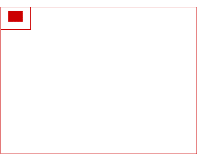
viewBox=”x, y, width, height” 【x:左上角横坐标,y:左上角纵坐标,width:宽度,height:高度】

理解:svg 容器范围内,从 x,y 坐标点 截取 width, height 大小的图像,铺满整个 svg 容器

preserveAspectRatio

<svg> 属性,作用对象是 viewBox

preserveAspectRatio=”xMidYMid meet”

值一:
xMin: viewport和viewBox左边对齐
xMid: viewport和viewBox x轴中心对齐
xMax: viewport和viewBox右边对齐
YMin: viewport和viewBox上边缘对齐。注意Y是大写。
YMid: viewport和viewBox y轴中心点对齐。注意Y是大写。

值二:
meet: 保持综横比缩放 viewBox 适应 viewport
slice: 保持纵横比同时比例小的方向放大填满viewport,攻
none: 扭曲纵横比以充分适应viewport

use

引用 svg 文档内某一个节点,深度克隆

<use x="50" y="30" xlink:href="#Port" class="classA"/>

symbol

定义图像模板,本身不会输出任何图像,必须使用 use 实例化后才会显示

1
2
3
4
<symbol id="sym01" viewBox="0 0 150 110">
<circle cx="50" cy="50" r="40" stroke-width="8" stroke="red" fill="red"/>
<circle cx="90" cy="60" r="40" stroke-width="8" stroke="green" fill="white"/>
</symbol>

g

定义分组,组内元素继承 g 标签上所有属性,样式及渲染

1
2
3
4
<g stroke="green" fill="white" stroke-width="2">
<circle cx="25" cy="25" r="15"/>
<circle cx="40" cy="25" r="15"/>
</g>

基本图形

rect、cicle、ellipse、line、polyline、polygon

属性:

opacity:整个图像透明度
stroke:边框颜色
stroke-width:边框宽度
stroke-opcaity:边框颜色透明
fill:填充
fill-opacity:填充颜色透明

stroke-linecap:端头样式(圆形、方块)
stroke-dasharray:创建虚线

矩形:
x,y width,height rx,ry:定义圆角

园、椭圆:
cx,cy:圆心 r:半径 rx,ry:椭圆半径

直线:
x1,y1, x2, y2

折线:
points="x0,y0 x1,y1 x2,y2" 多个坐标点 空格 隔开

多边形:
fill-rule:nonzero | evenodd | inherit

path

M(x,y):移动画笔到 x,y 坐标点,仅移动不绘制

L(x,y):当前画笔坐标点,画直线连接到 (x,y)
H:画横线
V:画竖线

C:三次方贝塞尔曲线
S:平滑三次方贝塞尔曲线

Q,T:二次方,平滑

A(rx, ry x-axis-rotation large-arc-flag, sweepflag x, y):椭圆弧线

从当前画笔位置绘制一条弧线到 x,y rx,ry:椭圆弧线水平,垂直方向半径,x-axis-rotation:弧线绕 x 轴旋转度数, large-arc-flag:最大弧标志位(0|1),sweepflag:弧线绘制方向

Z:闭合路径

m, l, h, v, c, s, q, t, a, z 使用相对坐标点

clipPath

蒙版外内容不可见

文字文本

text、tspan

属性:

transform="rotate(30 20,40)"

文本添加超链接:

1
2
3
4
<a xlink:href="http://know.webhek.com/svg/" 
target="_blank">
<text x="0" y="15" fill="red">SVG是个好东西!</text>
</a>

滤镜

<defs> :滤镜包裹容器
<filter>:定义滤镜,需要 id 属性

  • 模糊滤镜 <feGaussianBlur in="SourceGraphic" 效果应用于整个图片 stdDeviation="15" 定义模糊的程度 />

  • 阴影效果

1
2
3
4
5
<feOffset result="offOut" in="SourceGraphic" dx="20" dy="20" />
<feColorMatrix result="matrixOut" in="offOut" type="matrix" values="0.2 0 0 0 0 0 0.2 0 0 0 0 0
0.2 0 0 0 0 0 1 0" />
<feGaussianBlur result="blurOut" in="matrixOut" stdDeviation="10" />
<feBlend in="SourceGraphic" in2="blurOut" mode="normal" />

动画标签

<animate>:实现单属性的过渡效果
<animateTransform>:实现transform变换动画效果
<animateMotion>:实现路径动画效果

1
2
3
4
5
6
7
8
9
10
11
12
13
14
15
16
17
18
19
20
21
22
23
24
25
26
27
28
29
30
31
<svg class="lds-message" width="80px" height="80px" xmlns="http://www.w3.org/2000/svg"  
viewBox="0 0 100 100" preserveAspectRatio="xMidYMid">
<g transform="translate(20 50)">
<circle cx="0" cy="0" r="7" fill="#e15b64" transform="scale(0.99275 0.99275)">
<animateTransform attributeName="transform" type="scale" begin="-0.375s"
calcMode="spline" keySplines="0.3 0 0.7 1;0.3 0 0.7 1" values="0;1;0"
keyTimes="0;0.5;1" dur="1s" repeatCount="indefinite"></animateTransform>
</circle>
</g>
<g transform="translate(40 50)">
<circle cx="0" cy="0" r="7" fill="#f47e60" transform="scale(0.773605 0.773605)">
<animateTransform attributeName="transform" type="scale" begin="-0.25s"
calcMode="spline" keySplines="0.3 0 0.7 1;0.3 0 0.7 1" values="0;1;0"
keyTimes="0;0.5;1" dur="1s" repeatCount="indefinite"></animateTransform>
</circle>
</g>
<g transform="translate(60 50)">
<circle cx="0" cy="0" r="7" fill="#f8b26a" transform="scale(0.42525 0.42525)">
<animateTransform attributeName="transform" type="scale" begin="-0.125s"
calcMode="spline" keySplines="0.3 0 0.7 1;0.3 0 0.7 1" values="0;1;0"
keyTimes="0;0.5;1" dur="1s" repeatCount="indefinite"></animateTransform>
</circle>
</g>
<g transform="translate(80 50)">
<circle cx="0" cy="0" r="7" fill="#abbd81" transform="scale(0.113418 0.113418)">
<animateTransform attributeName="transform" type="scale" begin="0s"
calcMode="spline" keySplines="0.3 0 0.7 1;0.3 0 0.7 1" values="0;1;0"
keyTimes="0;0.5;1" dur="1s" repeatCount="indefinite"></animateTransform>
</circle>
</g>
</svg>